DAN
- Client
- DAN Group
- Service
- Brand identity
- Year
- 2026
- Team
- Artsem Pakanechny — art direction, design
- Scope
- Strategy, logo & symbol, identity system, pictograms, presentation, merch
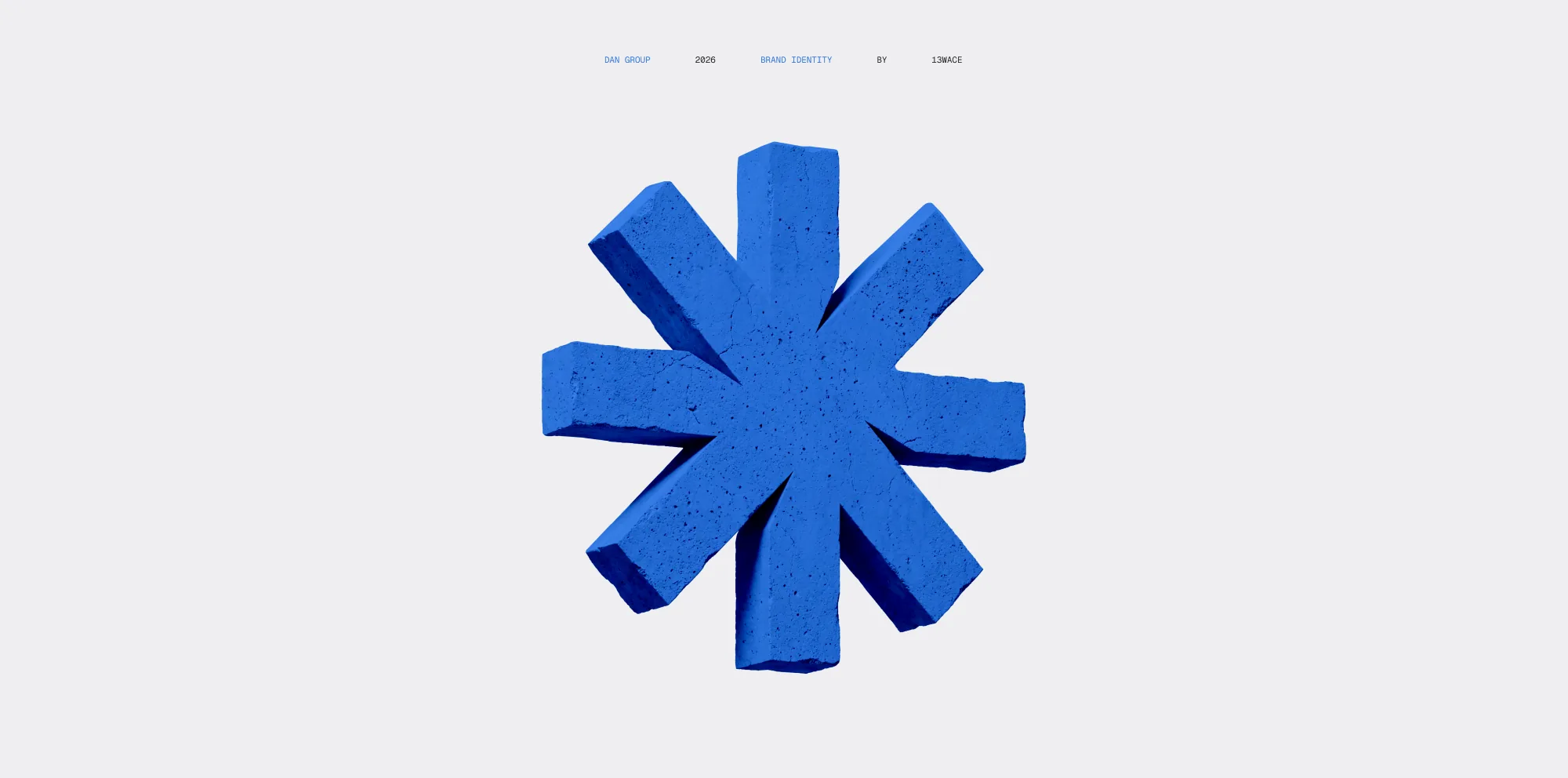
DAN — architecture of engineering solutions.
The master brand shaping a unified architecture for all of the company's production divisions.
Each division solves its own technical task, but operates by the standards set and developed by DAN
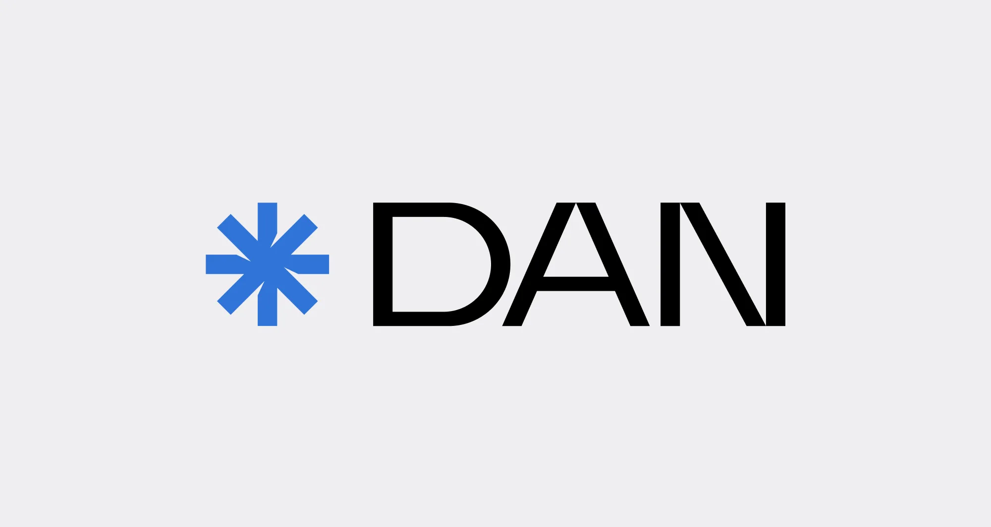

The DAN logo is a combination mark.
It consists of a symbol and a wordmark.
The wordmark is built on sans-serif, strict forms. The letters have straight lines and precise geometry, emphasizing the brand's technical character
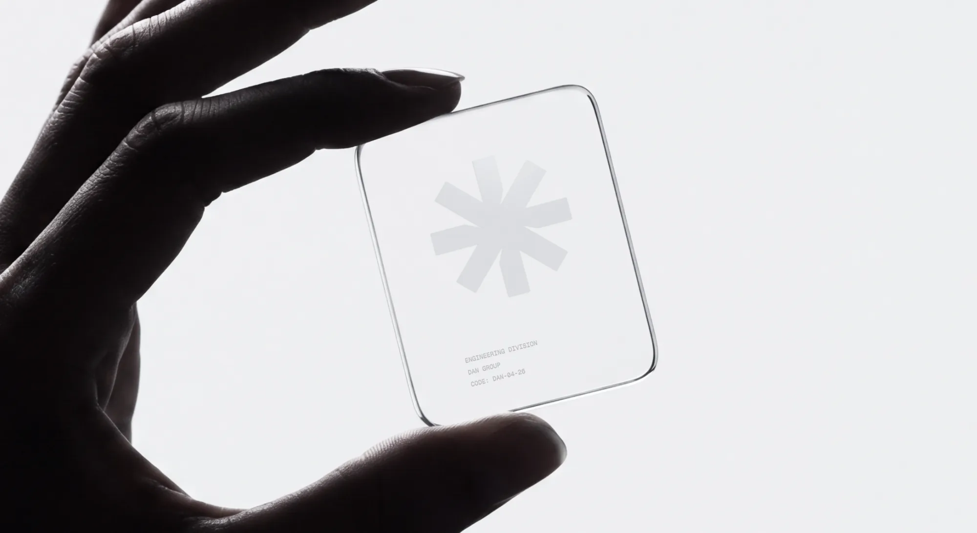
The DAN symbol is a point where directions intersect, the union of brands into a single system. Its shape recalls an engineering star — a sign of precision, calculation, and professional authority. The repeating cutouts reflect a modular principle: each element stands on its own, yet together they form a stable structure
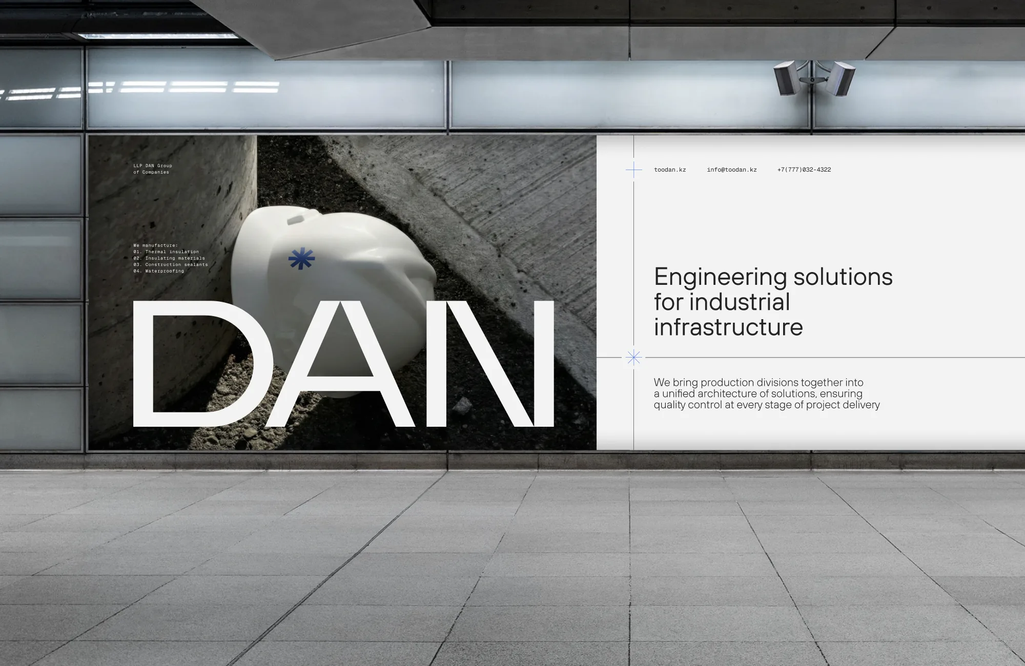
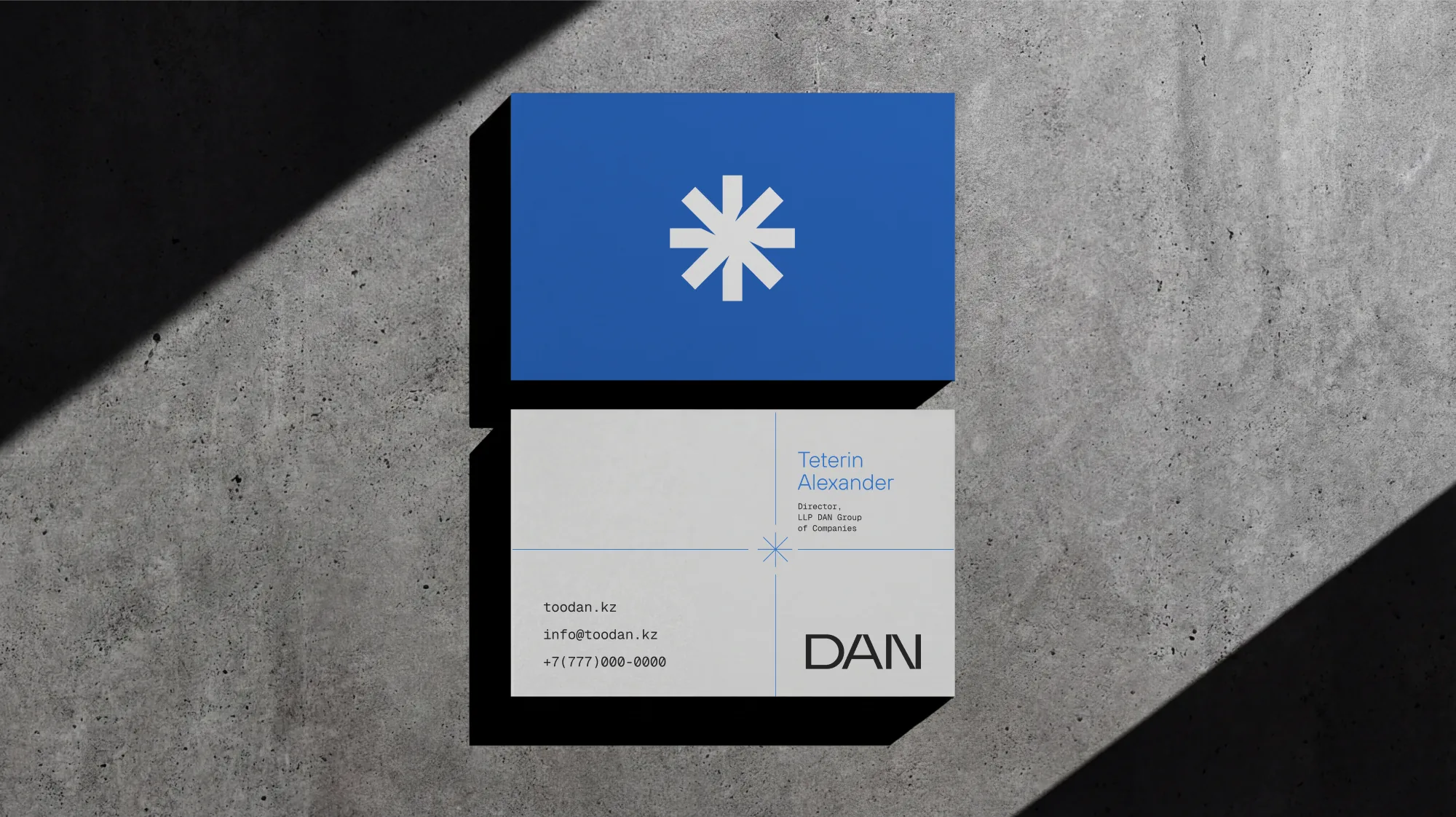
The graphic system is based on the intersection of a vertical and a horizontal line.
At the point where they meet, an icon echoing the symbol forms the visual centre of the layout.
Each intersection becomes a metaphor for control, coordination and engineering precision
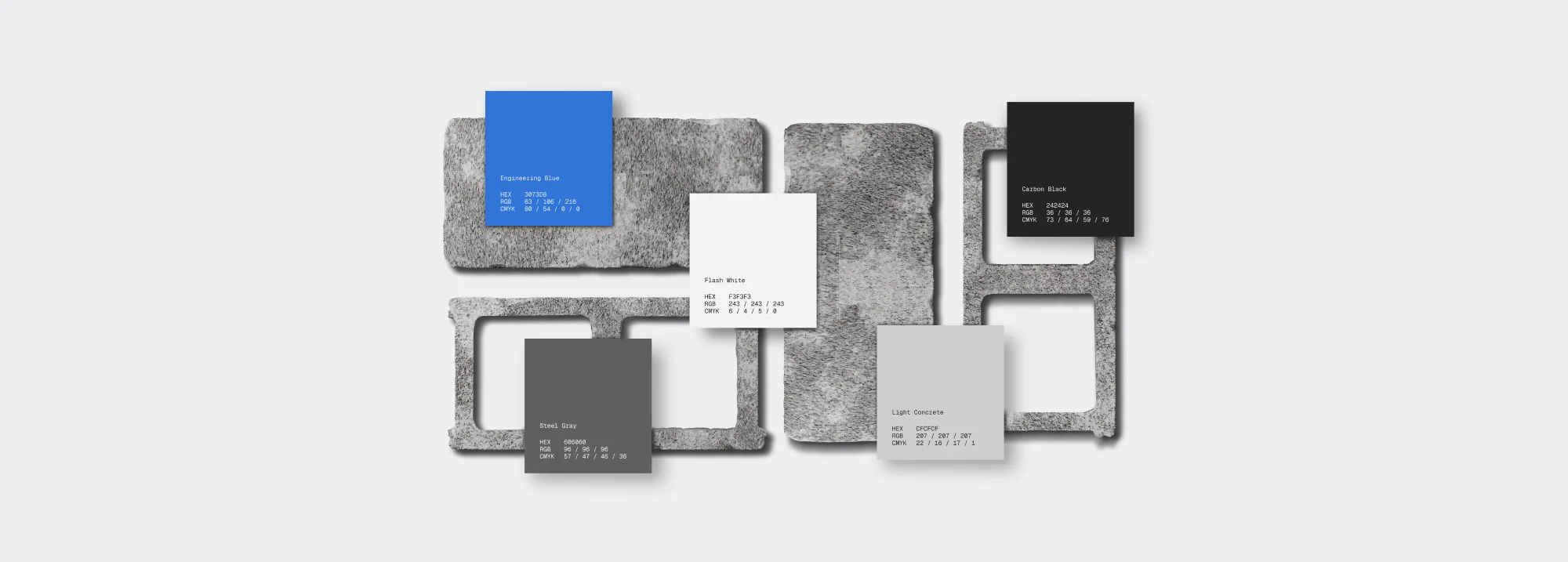
The palette is built on Engineering Blue and four greyscale tones. Carbon Black, Steel Gray, Light Concrete and Flash White echo the materials DAN works with.
Blue is used as an accent — it marks key points, data and the symbol itself
Typography separates two levels of communication.
TT Hoves Pro is used for headlines and main text — strict geometry and a neutral character.
Geist Mono carries technical information: specifications, tables, markings and codes
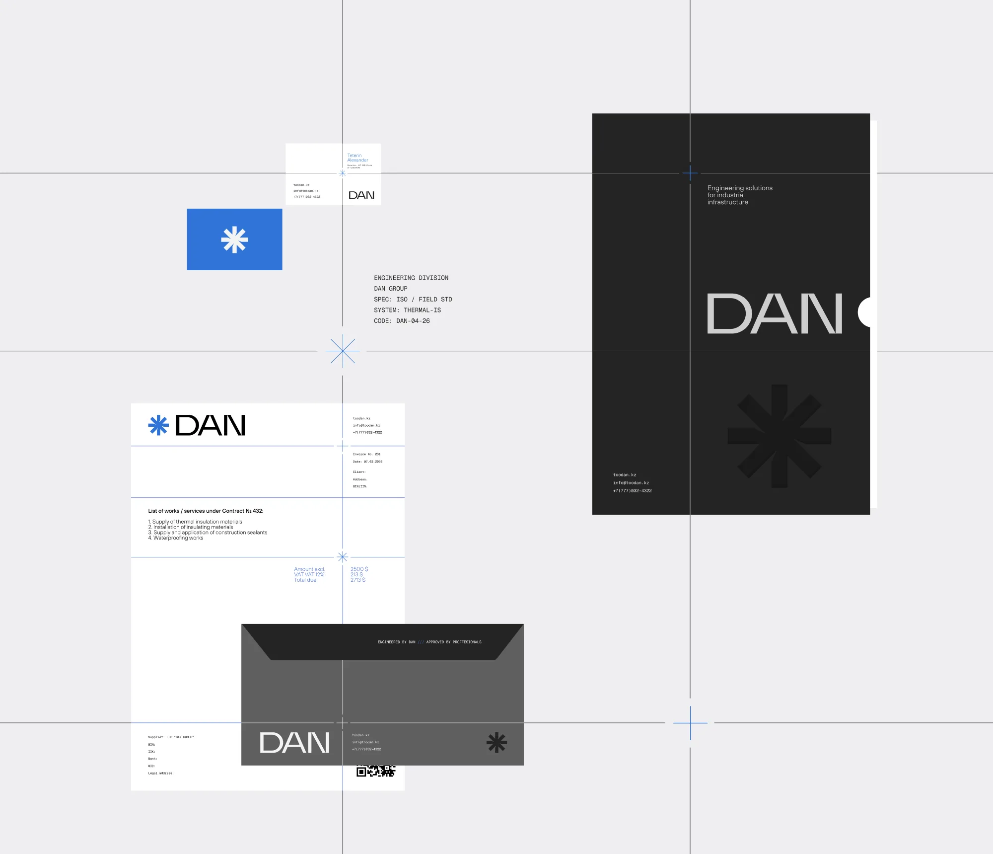
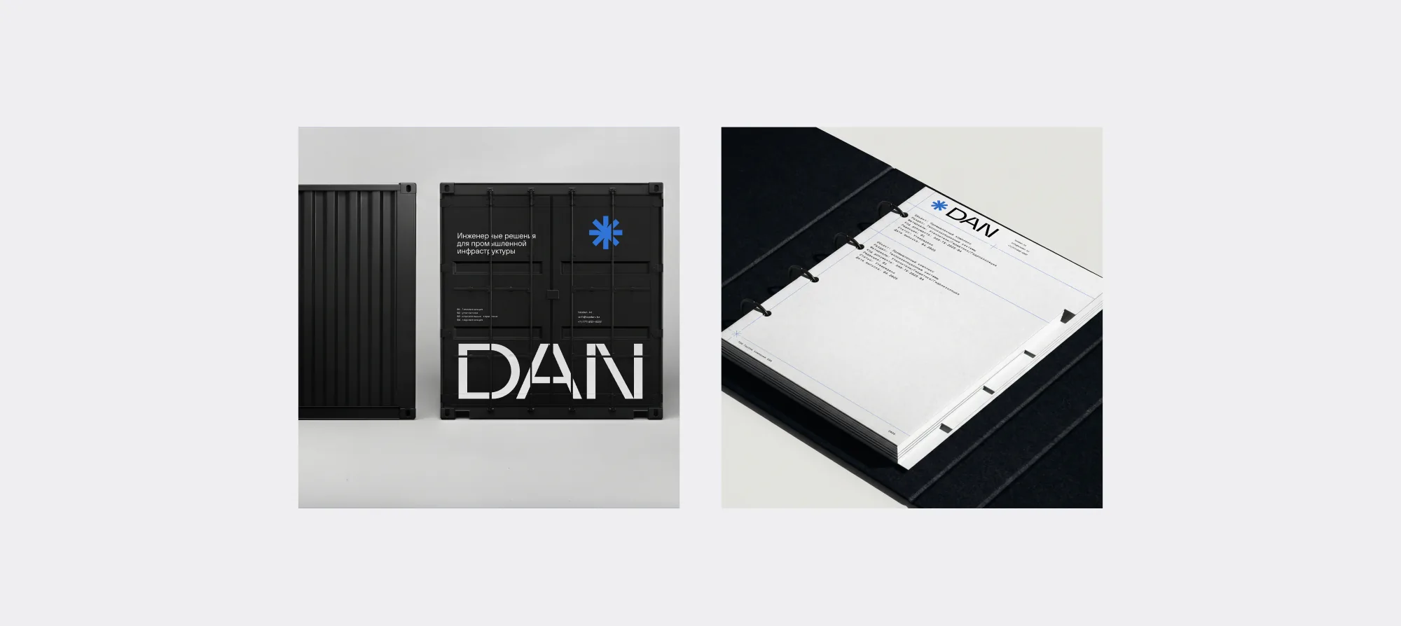
Business documentation follows the same grid of axes and intersection points.
Invoices, letterheads, business cards and envelopes share one structure, where Geist Mono carries all technical data.
The documents read like engineering drawings — clear, regulated and easy to scan
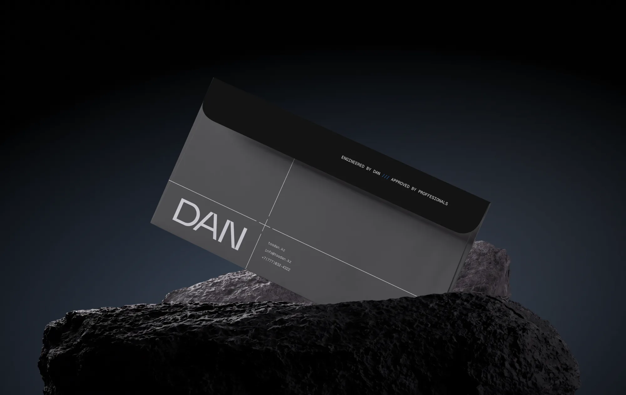
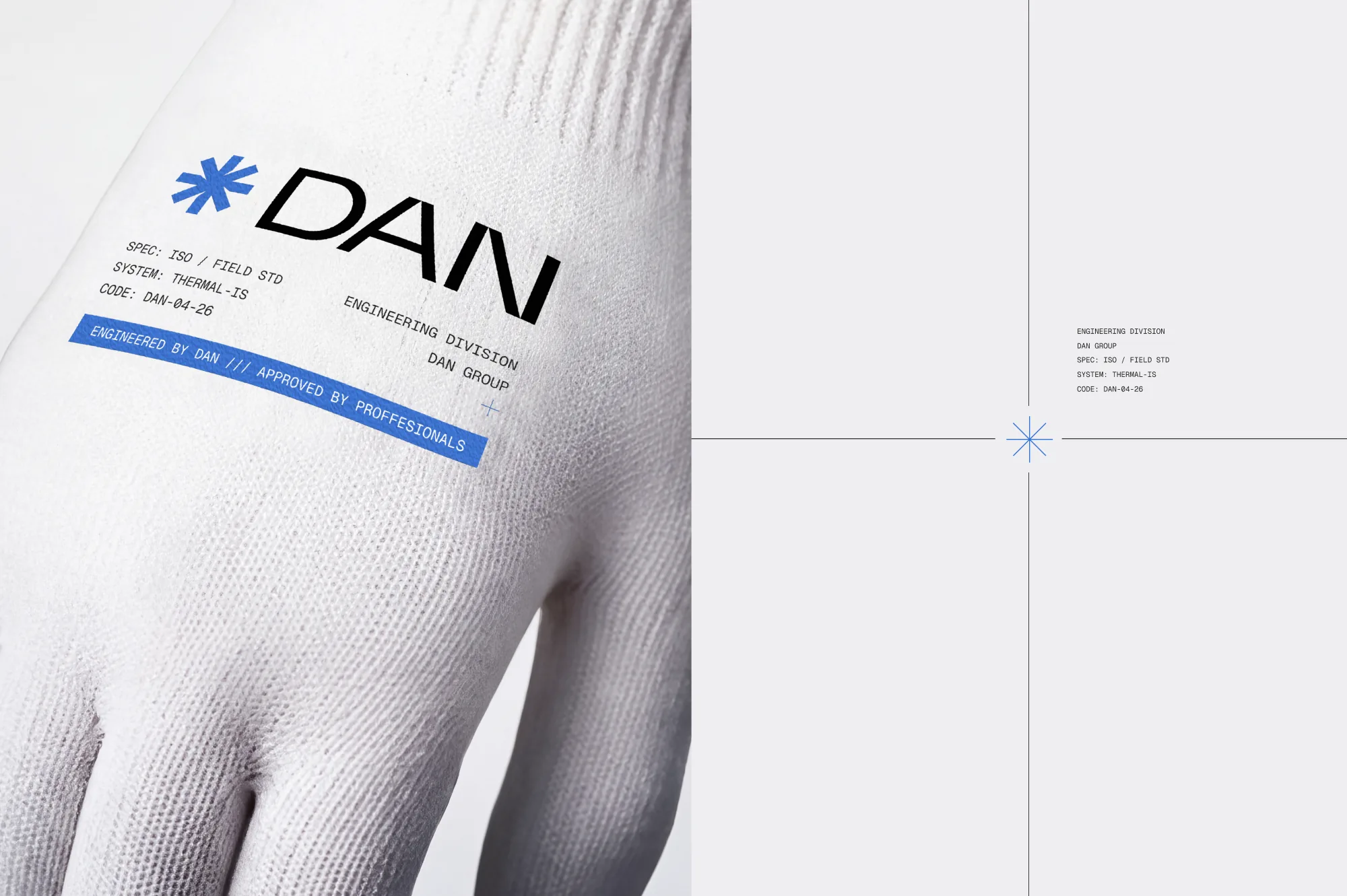
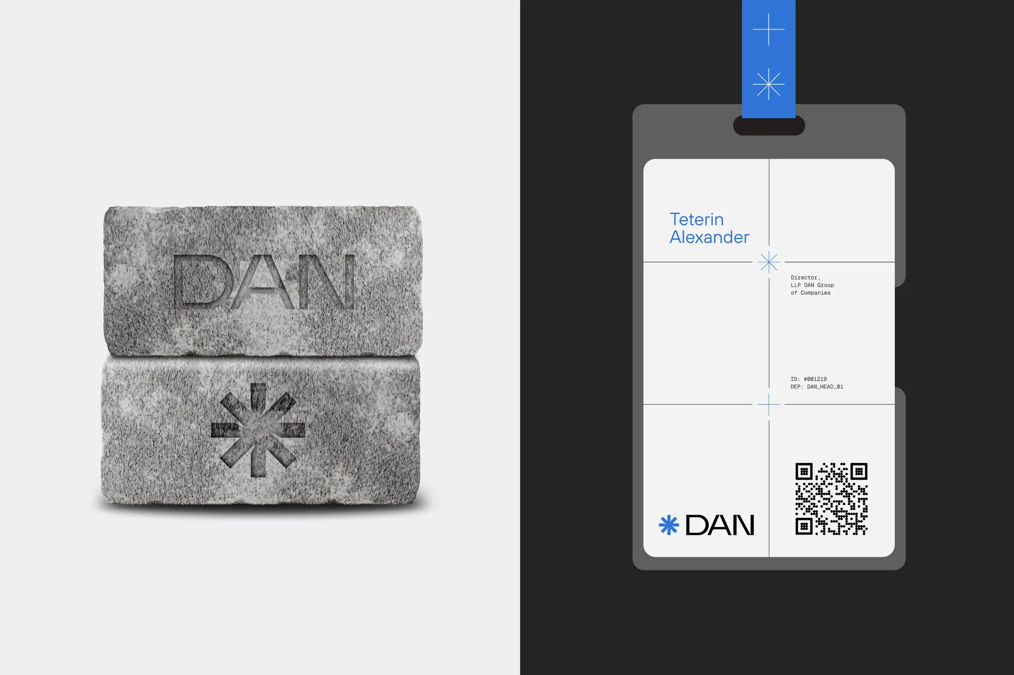
Branded items extend the system from documents into everyday work.
Badges, business cards and workwear use the same axes, intersection points and Geist Mono markings.
Every item reads as part of one engineering standard — on site, in the office and at meetings
DAN has its own set of 31 line pictograms.
They cover application areas, load factors, working principles and technologies.
Each pictogram is drawn on a 48 px grid with a 2.5 px stroke — the same precise engineering geometry as the DAN symbol
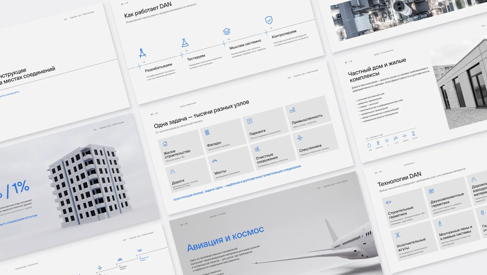
Alongside the identity, we designed a 21-slide company presentation for print, PDF and screen.
It is built entirely on the DAN system: the intersection grid, Geist Mono captions and Engineering Blue accents.
The presentation carries the brand from the identity into sales communication
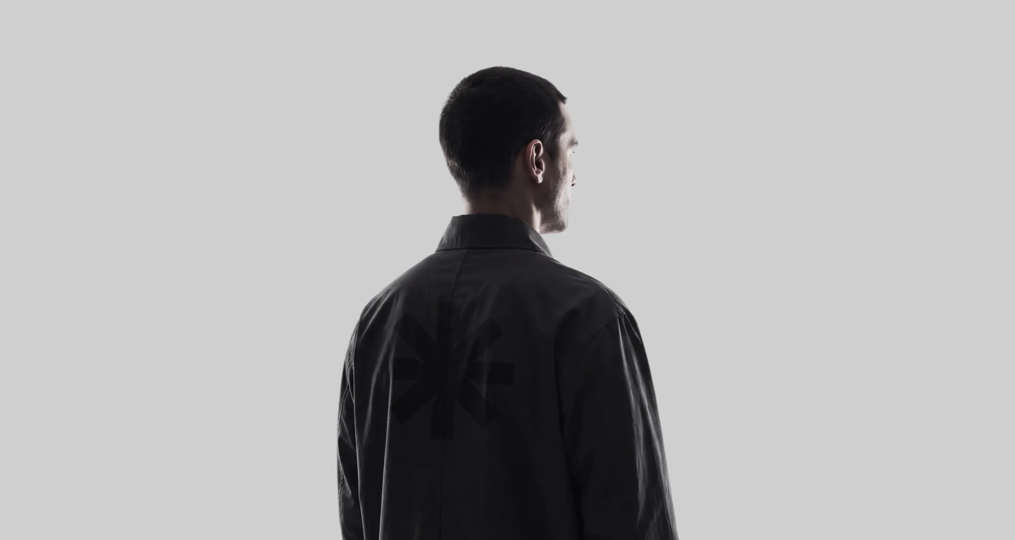
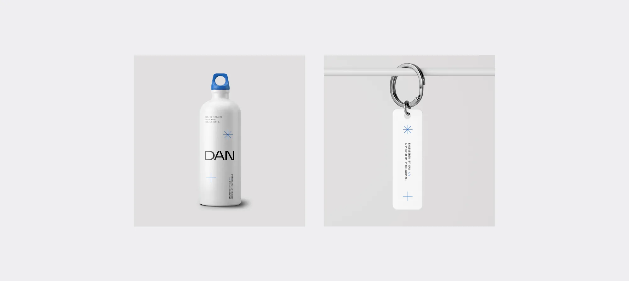
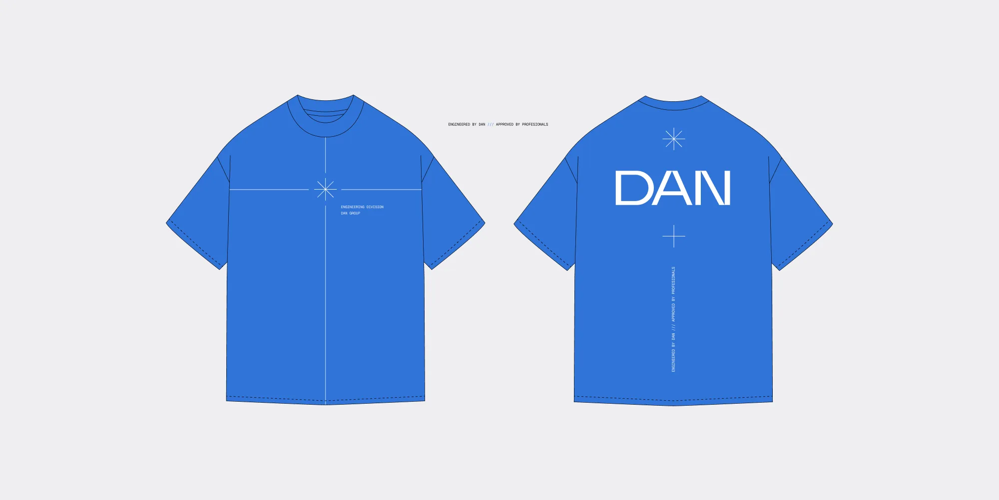
Merch moves the brand from documents into the field.
Workwear, gloves, bottles and keychains carry the symbol and technical markings like equipment labels. Each item looks like part of an engineering kit rather than a souvenir